Responsive Web Design
DrummerHead
March 11, 2012
Slides: mcdlr.com/rwd
DrummerHead
March 11, 2012
Slides: mcdlr.com/rwd
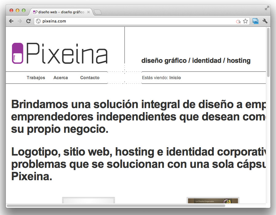
I work as lead application designer & front end developer at Cubox.
You can check us out at cuboxlabs.com
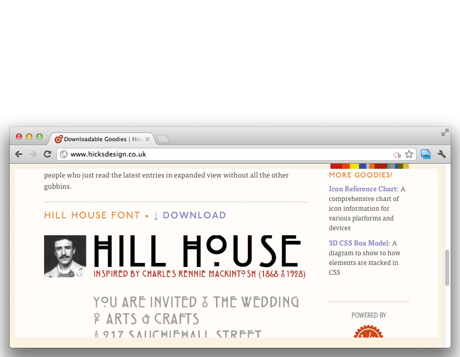
Here’s a nice example:
www.hicksdesign.co.uk
The meta viewport tag tells
mobile browsers' viewport how to behave.
Respect my mobilitah!

<meta name='viewport'
      content='width=device-width, initial-scale=1'>
With this one you also disallow zooming:
<meta name='viewport'
      content='width=device-width, initial-scale=1, maximum-scale=1'>
Add text-size-adjust declarations to so declared text sizes are always respected
html {
  -webkit-text-size-adjust: 100%;
  -ms-text-size-adjust: 100%;
}
<!doctype html>
<html>
<head>
  <title>Title</title>
  <meta charset='utf-8'>
  <meta name='viewport' content='width=device-width, initial-scale=1'>
</head>

<body>
<header>
  <h1>Title</h1>
  <nav>
    <ol>
      <li>
        <a href='#'>alpha</a>
      </li>
      <li>
        <a href='#'>bravo</a>
      </li>
    </ol>
    <form id='search'>
      <input type='search' placeholder='Need to find something?'>
      <input type='submit' value='search'>
    </form>
  </nav>
</header>

<div id='main'>
  <h2>Main Content</h2>
  <p>Juicy content</p>
</div>

<aside>
  <h2>Sidebar</h2>
  <p>Complementary content</p>
</aside>

<footer>
  <h2>Footer</h2>
  <p>Information about the document</p>
</footer>

</body>
</html>
And here it is with some basic visual styling (no layout yet)
RWD example 02so what about the layout?
html {
  padding: 2% 5%;
}
body {
  max-width: 80em;
  margin: 0 auto;
}
header,
#main,
aside,
footer {
  margin: 0 0 2% 0;
  padding: 2% 3%;
}
nav ol {
  width: 50%;
  float: left;
}
nav ol li {
  width: 33.3333333%;
}
#main {
  width: 65%;
  float: left;
}
aside {
  width: 20%;
  float: right;
}
RWD example 05
@media (min-width: 777px) {
  stuff-is-applied-to-things: bigger-than-min-width;
}
The viewport has to be at least min-width for these styles to be applied
@media (max-width: 777px) {
  stuff-is-applied-to-things: less-than-max-width;
}
The viewport has to be up to max-width for these styles to be applied
@media (max-width: 920px) {
  body {
    font-size: .9em;
  }
  #main,
  aside {
    width: auto;
    float: none;
  }
}
@media (max-width: 480px) {
  html {
    padding: 2%;
    background-color: #ddd;
  }
  body {
    font-size: .8em;
  }
  header,
  #main,
  aside,
  footer {
    background-color: #eee;
  }
}
@media (max-width: 320px) {
  html {
    padding: 0;
  }
  header,
  #main,
  aside,
  footer {
    margin: 7% 0;
    padding: 7% 4%;
    border: none;
  }
}
RWD example 06
Empty your mind. Be formless, shapeless: like water. Now you put water into a cup, it becomes the cup. You put water into a bottle, it becomes the bottle. You put it in a teapot, it becomes the teapot. Water can flow, or it can crash. Be water my friend
My twitter stuff at @DrummerHead and also you can check our responsive site at cuboxlabs.com
If you’re interested, the example is a stripped version of my WAI-ARIA Cheatsheet
Nifty RWD experminet: mcdlr.com/resp
Slides: mcdlr.com/rwd
Video: mcdlr.com/responsive-web-design-presentation